In the index page of current blog, we have a picture shown as below - if we hover the mouse over the image, it will change to another picture and also as we move our mouse, the image will tilt along with the mouse moving.

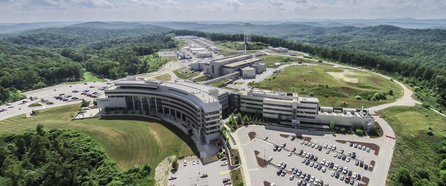
Spallation Neutron Source
Oak Ridge National Laboratory
The codes for displaying the effect above is presented below,
<div align='center' class='card' data-tilt data-tilt-scale="0.9">
<img src="/assets/img/ORNL.png"
   alt="SNS"
   title="SNS" />
   <img src="/assets/img/SNS.jpg" class="img-top" alt="ORNL">
<div class="centered-text"><h1>Spallation Neutron Source</h1></div>
<div class="centered-text-1"><h1>Oak Ridge National Laboratory</h1></div>
</div>

<script src="https://cdnjs.cloudflare.com/ajax/libs/vanilla-tilt/1.7.2/vanilla-tilt.min.js"></script>
Here is its implementation in the index.md file for current blog, Click Me!
Accordingly, the CSS configuration relevant to such an image effect is shown below,
1 2 3 4 5 6 7 8 9 10 11 12 13 14 15 16 17 18 19 20 21 22 23 24 25 26 27 28 29 30 31 32 33 34 35 36 37 38 39 40 41 42 43 44 45 46 47 48 49 50 51 52 53 54 55 56 57 58 59 60 61 62 63 64 65 66 67 68 69 70 71 72 73 74 75 76 77 78 79 80 81 82 83 84 85 86 87 88 | .card { position: relative; display: inline-block; border: none; display: flex; flex-direction: solumn; align-items: center; justify-content: center; color: #fff; transform-style: preserve-3d; transform: perspective(1000px); } .card .img-top { display: none; position: absolute; top: 0; left: 0; z-index: 99; } .card:hover .img-top { display: inline; } @media screen and (min-width: 500px) { .card .centered-text { display: none; position: absolute; top: 5%; left: 27%; transform: translateZ(50px); z-index: 99; } .card:hover .centered-text { display: inline; } .card .centered-text-1 { display: none; position: absolute; top: 18%; left: 23%; transform: translateZ(50px); z-index: 99; } .card:hover .centered-text-1 { display: inline; } h1 { font-size: 35px; } } @media screen and (max-width: 500px) { .card .centered-text { display: none; position: absolute; top: 5%; left: 35%; transform: translateZ(50px); z-index: 99; } .card:hover .centered-text { display: inline; } .card .centered-text-1 { display: none; position: absolute; top: 18%; left: 32%; transform: translateZ(50px); z-index: 99; } .card:hover .centered-text-1 { display: inline; } h1 { font-size: 10px; } } |
Here, to realize the tilting effect, we rely on the vanilla-tilt Javascript. The actual code is just the last line in the HTNL code snippet presented above. Detailed information about this library can be found here. Apart from that sinle line of code, we then need to put data-tilt in the HTML <div> section that contains the image we want to tilt (see the first line in the HTML code snippet above). We can realize that the text and the image is tilted differently so that it seems they are not on the same layer. That effect is realized by referring to the Creating a parallax effect section of this website. From the website instruction, we will see that this requires some special CSS configuration, which, in our case of current blog implementation, can be found here and here. To realize the showing and hiding effect for both the image and text on mouse hovering, we will rely on the definition of a parent CSS class card and its children class img-top, as presented in the CSS snippet above. Then another definition to account for the mouse hovering effect should be defined - see the .card:hover img-top presented above. Then we know that when mouse is not hovering, the image associated with the img-top class will not be shown (display: none). When mouse hovers on the default image, display: inline will then bring up the image associated with the img-top class on top of the default image.
N. B. The @media screen and (min-width: 500px) section in the CSS snippet above is enabled for browser with the width of at least 500px and @media screen and (max-width: 500px) is for browser with the width of at most 500px. This is the so-called media query to display in different manner for different browsers to realize the optimal display effect on various platforms (computer, ipad, or phone).